
This was not an easy article to write. The number one reason is it is 100% based on my opinion of viewing about 75-80 social/public housing websites over the last week. That is of course in addition to the hundreds I visited within my career for whatever reason. A quick disclaimer-***I made my picks on ease of finding information and the simplicity/easiness of doing business as a tenant***
I am not a programmer or design professional. I am just a social housing advocate/blogger who took sometime out to bring you, the reader, a couple websites to look at. Feel free to disagree and leave comments about your favorite website.
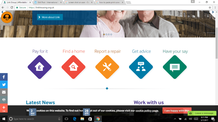
- Link Housing Group: Scotland- Click Here For Website I do indeed have a soft spot for the folks at Link. The Chief Executive Craig Sanderson was kind enough to take me around for a day as he did business in Glasgow. I believe he is twice my age but proved to have twice my energy. Back to the point, everyone should take a look at the simplicity and usefulness of this interface. Do not pack your page. Give your residents and applicants immediate access to what they need. That is true customer service at its finest.
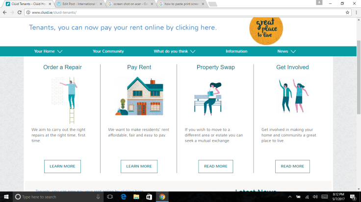
Link Housing - Cluid Housing Association: Ireland –Click Here for Website I don’t know a soul at this housing association but damn do I like this interface. Simple, to the point and easy to understand. We could all learn a lesson from our friends in Ireland.
Cluid Housing - Chicago Housing Authority-USA–Click Here For Website I know some good folks that have come from CHA and that still work there. I like the simplicity that comes with the tiles on the homepage. I will complain as I always do about overcrowding but I think it is a good example of an interface that is good for residents and applicants in the USA.

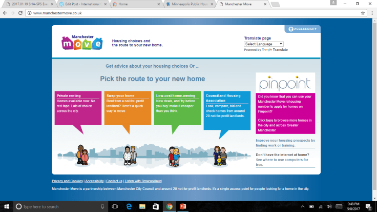
Chicago Housing Authority - Manchester Move: UK–Click Here For Website: I am a big fan of this website and how well the folks in Manchester do in explaining how to use it. I actually did a demo of this website when we were looking at our admissions process last year. This site allows for applicants and tenants to search for housing and understand what the process will be like in their search.
Manchester Move - Housing NSW: Australia- Click Here for Website- The big kicker for me is the ability for a tenant or applicant to access information regarding their account, pay rent, order maintenance repairs and generally have a full service portal. This interface checks all the buttons. I will say the landing page is a little crowded but all in all I think many social housing providers can learn a lot from our friends down under.

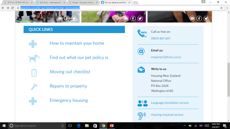
Housing NSW - Housing New Zealand: New Zealand- Click Here for Website HNZ is a monstrous organization trying to handle housing throughout the country. The website therefore needs to fill quite a roll. It takes few clicks to make the way to the tenant screen, but once you arrive it is clear how a tenant can take care of his or her business with the housing company. I wonder if moving Quick Links up on the page has ever been discussed? Either way, nice page.
Housing New Zealand
There it is. Do you agree? If you do not, please feel free to disagree without attacking the providers I highlighted. Critiques are welcome. Please share any other sites you like as a comment.

Leave a comment